EverTrust Bank: Mobile Banking Redesign
A self-directed UX/UI exploration for a mid-size bank's mobile app, built around a simple brief: make digital banking feel calm and trustworthy instead of corporate and cluttered.
The Brief
EverTrust's mobile app was functional but dated, a common story for mid-size banks competing against Chime, SoFi, and Monzo. The ask: a full UX/UI redesign that simplifies day-to-day banking while making security and trust feel built-in, not bolted-on.
The Approach
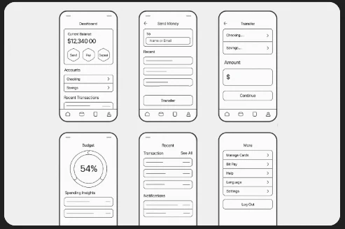
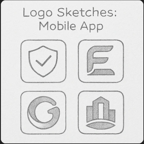
Concepted an interface around one idea: reduce friction on the tasks people do daily (checking balances, sending money, tracking budgets) before adding anything else. Explored four logo directions (a shield, a lettermark, a swirl, a skyline) to find a mark that read as secure without feeling cold.
The Direction
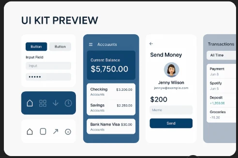
Landed on a calm navy-and-teal UI kit with clear visual hierarchy: a dashboard-first layout, biometric login front and center, and a budget tracker that uses a simple progress ring instead of overwhelming charts.
Concept Direction
Early logo exploration and the resulting UI kit, built to feel secure, modern, and easy to scan at a glance.
Deliverables
Scoped as a concept UX/UI package, not a full production build.
Complete wireframe set for six key mobile screens
UI kit covering buttons, inputs, cards, and account views
Four early logo/app-icon concept directions
Brand tone: calm, trustworthy, jargon-free copy direction

Have a product that needs a UX pass?
Let's turn a rough brief into an interface people actually enjoy using.